& co
A digital solution to help young adults create, plan and share invites for social events.
CASE STUDY

Project Overview
THE PROBLEM
Meeting friends is important, but many things can delay or prevent plans. This includes trouble syncing schedules, budget constraints, multiple conversation channels and lack of inspiration.
THE SOLUTION
An all-in-one solution to help young people and their friends get together easily & plan their social calendars. Features include: calendar syncing, polls, bespoke groups and AI-generated suggestions.
KEY OUTPUTS
Two rounds of qualitative user research and affinity mapping.
Informed experience map and user flows.
Three rounds of usability testing with primary users to improve wireframes.
Atomic UI Library and the foundations of a design system for the app.
MVP of the app and marketing website.
Role
UX/UI DESIGN
Duration
10 WEEKS
Tools
FIGMA, MOBBIN, NOTION, OTTER.AI
Platform
iOS
Design Process
1/3
of social plans
that are made
never happen
26%
of people admit
saying yes to a plan
they actually would
not attend
23.9m
hours are spent per
week in the UK
making plans
82%
of people have
withdrawn from a
scheduled event at
the last minute
User Interviews
Next step was primary user interviews with four participants. The aim was to gain decontextualised, qualitative insights on their current behaviours and attitudes.
Key Questions Asked
How do you typically go about making plans with friends?
Have you ever found it difficult to make these plans?
Describe a time where plans fell through. What happened and why?
What factors do you consider when deciding on a group activity or outing?
And the most important question of all
Why?
Participants

BV, 25
Reformed Introvert

AO, 27
Serial Socialiser

SS, 24
No-frills Foodie

CP, 26
Man with a Plan
Affinity Mapping
Once all questions were asked and answered, I categorised these into behaviours, motivations and pain points then extracted key themes and insights.


Insights and Themes
Inefficient communication
Communication often takes too long, important information gets lost in the noisee, and there are multiple channels of conversation for the same plan.
Busy schedules
With many people having full calendars and busy schedules, finding a time to meet and put together a plan is difficult.
Convenient location
Plans are primarily dependent on a convenient location and budget restrictions. When these aren't aligned, plans are more likely to fall through.
02 / 05
Synthesis
Persona
To help focus in the HMW on my target user group (young adults), I created a persona that would represent the primary user. Meet Sam.


Experience Mapping
With the persona in hand, I created a map of the current experience to reflect the major pain points and motivations of my target user as well as give me an insight into the possible opportunities for intervention and potential solutions.

Task Flow Mapping
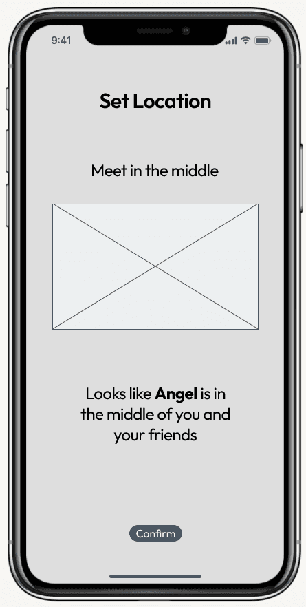
With a greater understanding of how to deliver value to the end user, I created a primary task flow off the back of user stories and epics. The key achievable here is to create and share a plan.

03 / 05
Ideation
Sketches
Referencing a UI Inspiration board, I put together a series of sketches to map out the primary task flow, all the while consulting my persona and user stories to ensure each main problem had a solution.


04 / 05
Prototyping
Wireframes
With sketches complete, I then moved onto creating a series of mid-fidelity wireframes that I could prototype together.


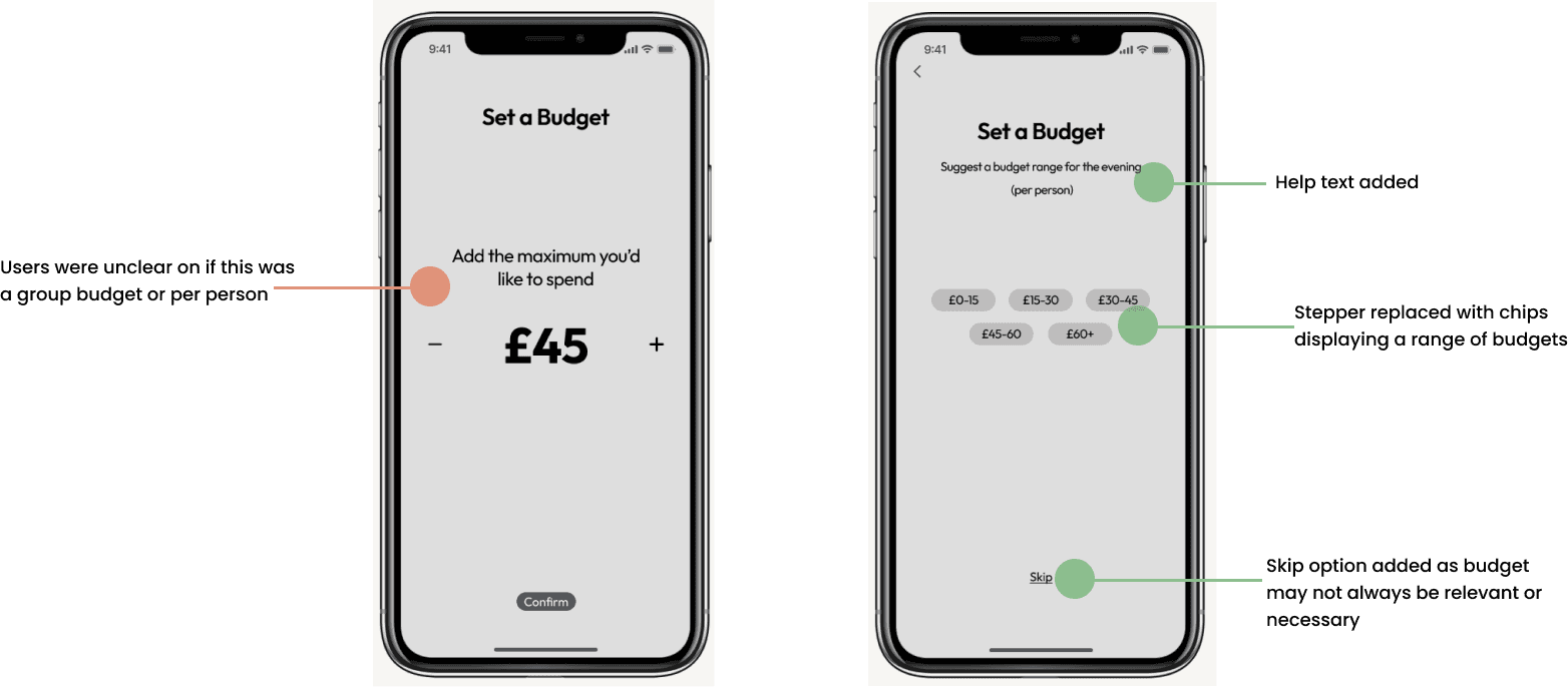
Usability Testing
Aim: Evaluate my design decisions. Ultimately, establish if users can successfully complete tasks with different variations of the prototype and test the end user’s experience. Here I learnt the value of testing to ensure I was designing for the user and not myself (!)
Methodology: Each participant was set the main task of creating and sharing a plan with friends. This was broken down into further sub-tasks to properly evaluate usability of the app. Each was asked gentle questions about what they thought of each screen and what they would expect to see.
Participants: Overall, eight users tested the prototype at various stages. They each fell into the target audience of young adult who likes to plan group activities with friends, but has had some difficulty in the past.


05 / 05
High-Fidelity Branding
Colours
I wanted my brand to feel youthful, chill, friendly, slick, fun and stress-free. To reflect this, I chose the following colours to be used through the app and within the branding.
Name and Wordmark
UI Library
When it came to high-fidelity, I also explored the creation of a design system by incrementally building up a UI Library. Using the Atomic Design approach, I created atoms, molecules, organisms, templates and pages to maintain project cohesion and act as a source of truth for the experience.
Introducing &co


IOS APP
RESPONSIVE MARKETING WEBSITE
Key Learnings
01
Organisation is key.
Organisation and non-destructive practice is key to ensure you can steadily map the progress of your work and make it easier for others to follow along comprehensively. When it came to making the hi-fi designs, I was far better off for having spent the time carefully curating UI Inspiration, noting peer and user comments, and building an organised flow.
02
Follow your findings.
When user testing, it's not just the success of a task flow that counts. Along the way, I noted down many observations about my users, following both what they told me and their behaviour. The usability testings rounds completed propelled the app in a way that would have been tricky had I been working in isolation.
03
Don't shy away from iterating.
Linked to the second learning, I also found that iteration is key. Though I found myself getting attached to certain design choices, I found that putting myself in the shoes of the user allowed me to iterate more freely. It was through this process and a string of different designs that the final MVP for &co was born.
Next Steps

Test and iterate.
